openrct2-stack-ui
✨ Easy-to-use UI framework for OpenRCT2 plugin developer.
Author:
 nExmond
Submitted:
over 2 years agoUpdated:
over 2 years agoStars:
4Tags:
License:
MITLinks:
GitHub Repository nExmond on GitHub
✨ Easy-to-use UI framework for OpenRCT2 plugin developer.
[한국어]
✨ Getting Started
- Fork this repository. (It can be used as a base template for creating plugins.)
- Clone the forked repository in the directory reserved for development.
- Download file openrct.2.d.ts and put it in directory
.../modules. - Start developing your plugins in the directory
.../develop.
🌍 Demo
Most of the usage examples are included in the demo plugin.
See file plugin.ts in directory .../develop.
⚙ Development
Read more about development below.
🎢 Process
Plugin development using StackUI consists of the following steps.
- Construct a window
//Constructs a single tabbed window with a blank label.
UIWindow.$(
    UITab.$(
        UILabel.$("")
    )
);- Preparing and setting up initial data
//Define and set the information to be displayed in the initial window.
const text = "Label";

UIWindow.$(
    UITab.$(
        UILabel.$(text)
    ).image(UIImageTabGears)
).title("Window");- Defining Proxies
//Defines proxies for passing commands to the UI and responding to actions.
const windowProxy = UIWDP.$();
const labelProxy = UIWP.$();

const text = "Label";

UIWindow.$(
    UITab.$(
        UILabel.$(text)
    ).image(UIImageTabGears)
).title("Window");- Binding Proxy
const windowProxy = UIWDP.$();
const labelProxy = UIWP.$();

const text = "Label";

//Bind the proxy to the UI.
UIWindow.$(
    UITab.$(
        UILabel.$(text).bind(labelProxy)
    ).image(UIImageTabGears)
).bind(windowProxy)
.title("Window");- Binding UI Actions
const windowProxy = UIWDP.$();
const labelProxy = UIWP.$();

const text = "Label";

UIWindow.$(
    UITab.$(
        UILabel.$(text).bind(labelProxy)
    ).image(UIImageTabGears)
).bind(windowProxy)
.title("Window");

//Write code to run based on UI actions.
windowProxy.didAppear((window) => {
    console.log(window.getTitle());
    console.log(`before: ${labelProxy.ui?.getText()}`);
    labelProxy.updateUI((label) => {
        label.text(`${window.getTitle()} is opened.`);
    });
    console.log(`after: ${labelProxy.ui?.getText()}`);
});- Open window
const windowProxy = UIWDP.$();
const labelProxy = UIWP.$();

const text = "Label";

UIWindow.$(
    UITab.$(
        UILabel.$(text).bind(labelProxy)
    ).image(UIImageTabGears)
).bind(windowProxy)
.title("Window");

windowProxy.didAppear((window) => {
    console.log(window.getTitle());
    console.log(`before: ${labelProxy.ui?.getText()}`);
    labelProxy.updateUI((label) => {
        label.text(`${window.getTitle()} is opened.`);
    });
    console.log(`after: ${labelProxy.ui?.getText()}`);
});

//Open a window based on the above.
windowProxy.show();
📄 Documents
💠 UIWindow
- $: Initialize with widget list
- $T: Initialize with tab list
Property
- spacing
- padding
- origin
- minSize
- maxSize
- isExpandable
- title
- selectedTabIndex
- selectedTabName
- theme
Action
- show
- updateUI
- close
- bringToFront
- findWidget
- bind
- getUITab
- getUIWidget
Handler
- onClose
- onTabChange
- didLoad
- didAppear
- didDisappear
📑 UITab
- $: Initialize with widget list
Property
- name
- spacing
- padding
- isExpandable
- minSize
- maxSize
- image
- title
- theme
- isHidden
Action
- updateUI
- bind
- getUIWidget
Handler
- didLoad
- didAppear
- didDisappear
🧒 UIWidget
Property
- origin
- offset
- extends
- size
- minSize
- occupiedSize
- name
- tooltip
- isDisabled
- isVisible
- font
- description
Action
- updateUI
- bind
- resetSize
Handler
- didLoad
- didAppear
- didDisapp
Drived widget
🛹 UIStack
- $: Initialize with widget list
- $V: Initialize the widget list by placing it vertically
- $H: Initialize the widget list by placing it horizontally
- $VG: Initialize by arranging the widget list vertically, and display the group box
- $HG: Initialize by arranging the widget list horizontally, and display the group box
Property
- axis
- spacing
- padding
- isGrouped
- title
- childs
🏷️ UILabel
- $: Initialize with string
Property
- align
- text
Handler
- onChange
🌌 UISpacer
- $: Initialize with spacing value
Property
- axis
- spacing
🔘 UIButton
- $: Initialize to text
- $I: Initialize to image
Property
- border
- image
- isPressed
- title
Action
- isImageEqual
Handler
- onClick
Derived widget 🔲 UIToggleButton
Action
- toggle
Handler
- onPress
🔄 UIPageImageButton
- $IP: Initialize with image list
Action
- images
- currentIndex
Handler
- onPage
🔁 UISpinner
- $: Initialize to default value
Property
- range
- step
- fixed
- value
- formatter
Action
- dialogueInfo
Handler
- onChange
✅ UICheckbox
- $: Initialize to title
- $UN: Initialize without title
Property
- isChecked
- text
Action
- toggle
Handler
- onChange
🔽 UIDropdown
- $: Initialize with string list
Property
- items
- selectedIndex
handler
- onChange
🔳 UIColorpicker
- $: Initialize to color
Property
- color
Handler
- onChange
🖼️ UIImageView
- $: Initialize to image
Property
- image
- theme
🎑 UIViewport
- $: Initialize to default value
Property
- position
- rotation
- zoom
- flags
- centerPosition
Action
- moveTo
- scrollTo
- scrollToMainViewportCenter
- moveToMainViewportCenter
- mainViewportScrollToThis
📃 UIListView
- $: Initialize with column list
Property
- scrollbarType
- isStriped
- showColumnHeaders
- selectedCell
- canSelect
- columnData
- itemData
- highlightedCell
- columns
- items
Action
- addColumn(s)
- addItem(s)
- clearAllItems
Handler
- onHighlight
- onClick
Child element 🏷️ UIListViewColumn
- $: Initialize to default width
- $F: Initialize to fixed column width
- $R: Initialize to range column width
- $W: Initialize to percentage column width
Property
- sortOrder
- canSort
- tooltip
⚪ UIListViewItem
- $: Initialize with string list
- $S: Initialize to string as separator
Property
- isSeparator
- elements
📄 UITextbox
- $: Initialize to string
Property
- text
- maxLength
Handler
- onChange
🛰️ UIProxy
- $: Default Initializer
Property
- ui
Action
- updateUI
Handler
- didLoad
- didAppear
- didDisappear
Derived proxy 💠 UIWindowProxy (UIWDP)
Action
- show
- close
Handler
- onTabChange
- onClose
📑 UITabProxy (UITP)
🧒 UIWidgetProxy (UIWP)
Handler
- onClick
- onChange
🖼️ UIImage
- $: Initialize to single image
- $A: Initialize as a continuous image
- $F: Initialize with non-contiguous images
Property
- isAnimatable
- duration
- offset
- singleFrame
- size
- description
- string
Action
- isEqual
🏗️ TextBuilder (TB)
- $: Initialize as text node
Property
- font
- outline
- color
- description
Action
- build
Child element ⭐ TextNode (TN)
- $: Initialize with text node list
- $S: Initialize to string
- $I: Initialize to image
- $NL: Initialize to newline node
Property
- outline
- color
⛑️ Helper ⏲️ IntervalHelper
Global: intervalHelper
Action
- start
- enabled
- end
🖼️ ImageHelper
Global: imageHelper
Action
- graphicsContext
🧩 UI Hierarchy
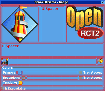
The containment relationship is:
UIWindow
    └ UITab (optional)
        └ UIStack (optional)
            └ UIWidget (UILabel, UIButton, ...)
            └ UIListView
                └ UIListViewColumn
                └ UIListViewItem
🔎 Find UI
You can usually control widgets through a proxy. However, you may want to use the UI without binding a proxy.
After setting the name of the UI item directly, use the function below.
- UIWindow
- getUITab
- getUIWidget
- UITab
- getUIWidget
🔃 Update UI
In general, you can update the UI by modifying the properties within the updateUI block.
const proxy = UIWP.$();

//...

proxy.onClick((w) => {
    w.updateUI(() => {
        w.isPressed(w.getIsPressed());
    });
});
It is possible to update the UI outside of the update block, but it is not recommended. It can cause unpredictable side effects.
const proxy = UIWP.$();

//...

proxy.onClick((w) => {
    w.isPressed(w.getIsPressed());
    w.updateUI();
});
💡 For windows and tabs, if some settings are changed,
the window may reopen internally for the changes to take effect.
This is independent of the life cycle.♻️ UI Life Cycle
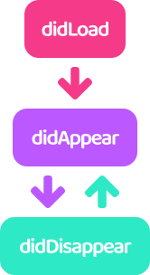
In StackUI, UI has a lifecycle and provides hooks according to its state.
- didLoad
- It is only called once when the UI is first loaded.
- didAppear
- Called whenever the UI appears on the screen.
- For UITab, it is called when activated.
- It has nothing to do with UIWidget.isVisible.
- didDisappear
- Called whenever the UI disappears on the screen.
- For UITab, it is called when deactivated.
- It has nothing to do with UIWidget.isVisible.
🖼️ Using Image
Images are initialized with sprite numbers.
(See the comments on UIImageConstants for related information.)
UIImages can be divided into 3 types:
- Sigle Image
- You can use it anywhere you use the image.
- Continuous Image
- Available only on tabs and buttons.
- Non-Continuous Image
- A custom type, currently only available for buttons.
Commonly used images are predefined and included in UIImageConstants.
💡 The amount of code included in the plugin can be burdensome,
so please comment out unused images.
🥂 Styled Text
TextBuilder allows you to create a styled string by combining TextNodes.
There are 3 types of TextNode.
- StringNode
- A string node.
- You can break the line with
\n.
- ImageNode
- Inserts an image between string nodes.
- NewlineNode
- A newline node.
- Display the next node starting from the next line.
TextBuilder defines the font of the string, and TextNode defines the color and outline of the string.
The following are the examples included in the demo.
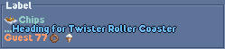
const formatted = TB.$(
        TN.$(
            TN.$I(UIImageShopItemChips),
            TN.$(
                TN.$S("Chips\n..."),
                TN.$(
                    TN.$S((1432).format(TextFormat.StringId, 53))
                        .color(TextColor.BabyBlue),
                    TN.$NL()
                ).outline()
            ).color(TextColor.Celadon),
            TN.$S((767).format(TextFormat.StringId, 77)),
            TN.$I(UIImageShopItemDoughnut),
            TN.$I(UIImageShopItemIceCream)
        ).color(TextColor.Topaz)
    ).build();
📑 Learn more
Position and size of the UI
- The size of the window is automatically adjusted within the minimum and maximum sizes based on the size of the widget.
- Widgets that are not sized are automatically scaled according to the size of the window.
- Widgets that are not sized are placed at regular intervals in the stack.
- Some widgets have a fixed height or width depending on their nature.
🚀 Building
Now let's apply the plugin you developed.
(This description is based on TypeScript.)
First, install the dependent modules.
> npm install
🏗️ Build
> npm run build
Outputs file plugin.js to directory .../develop.
⚠ All StackUI-related code is included in the plugin you develop.
This is because the `openrct2.d.ts` file, which is the basis of StackUI,
is updated at short intervals, and compatibility issues may occur.
🔄 Auto Build
> npm run watch
Whenever the plugin.js file is output by the npm run build command, it is copied to the plugin folder.
❗Tip. Enabling Hot Reload (Windows)
Open file .../Users/User/Documents/OpenRCT2/config.ini, change enable_hot_reloading = false to enable_hot_reloading = true and save.
📀 Distribution
> npm run build-product
Outputs the optimized plugin file, plugin.min.js, in the directory .../develop.
The default configuration is borrowed from plugin-devtools.
📜 License
This project is licensed under the MIT licence.