openrct2-stack-ui
✨ Easy-to-use UI framework for OpenRCT2 plugin developer.
Author:
 nExmond
Submitted:
over 5 years agoUpdated:
over 5 years agoStars:
4Tags:
License:
MITLinks:
GitHub Repository nExmond on GitHub
✨ Easy-to-use UI framework for OpenRCT2 plugin developer.
[한국어]
✨ Getting Started
- Fork this repository. (It can be used as a base template for creating plugins.)
- Clone the forked repository in the directory reserved for development.
- Download file openrct.2.d.ts and put it in directory
.../modules. - Start developing your plugins in the directory
.../develop.
🌍 Demo
Most of the usage examples are included in the demo plugin.
See file plugin.ts in directory .../develop.
⚙ Development
Read more about development below.
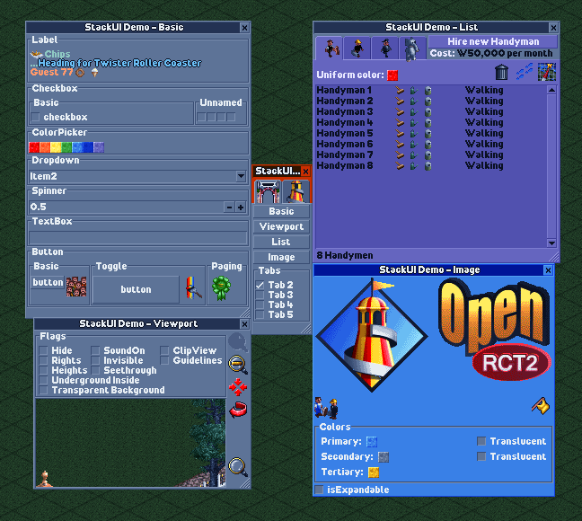
🎢 Process Plugin development using StackUI consists of the following steps. 1. Construct a window ```tsx //Constructs a single tabbed window with a blank label. UIWindow.$( UITab.$( UILabel.$("") ) ); ``` 2. Preparing and setting up initial data ```tsx //Define and set the information to be displayed in the initial window. const text = "Label"; UIWindow.$( UITab.$( UILabel.$(text) ).image(UIImageTabGears) ).title("Window"); ``` 3. Defining Proxies ```tsx //Defines proxies for passing commands to the UI and responding to actions. const windowProxy = UIWDP.$(); const labelProxy = UIWP.$(); const text = "Label"; UIWindow.$( UITab.$( UILabel.$(text) ).image(UIImageTabGears) ).title("Window"); ``` 4. Binding Proxy ```tsx const windowProxy = UIWDP.$(); const labelProxy = UIWP.$(); const text = "Label"; //Bind the proxy to the UI. UIWindow.$( UITab.$( UILabel.$(text).bind(labelProxy) ).image(UIImageTabGears) ).bind(windowProxy) .title("Window"); ``` 5. Binding UI Actions ```tsx const windowProxy = UIWDP.$(); const labelProxy = UIWP.$(); const text = "Label"; UIWindow.$( UITab.$( UILabel.$(text).bind(labelProxy) ).image(UIImageTabGears) ).bind(windowProxy) .title("Window"); //Write code to run based on UI actions. windowProxy.didAppear((window) => { console.log(window.getTitle()); console.log(`before: ${labelProxy.ui?.getText()}`); labelProxy.updateUI((label) => { label.text(`${window.getTitle()} is opened.`); }); console.log(`after: ${labelProxy.ui?.getText()}`); }); ``` 6. Open window ```tsx const windowProxy = UIWDP.$(); const labelProxy = UIWP.$(); const text = "Label"; UIWindow.$( UITab.$( UILabel.$(text).bind(labelProxy) ).image(UIImageTabGears) ).bind(windowProxy) .title("Window"); windowProxy.didAppear((window) => { console.log(window.getTitle()); console.log(`before: ${labelProxy.ui?.getText()}`); labelProxy.updateUI((label) => { label.text(`${window.getTitle()} is opened.`); }); console.log(`after: ${labelProxy.ui?.getText()}`); }); //Open a window based on the above. windowProxy.show(); ``` --- 📄 Documents --- 💠 UIWindow - $: Initialize with widget list - $T: Initialize with tab list Property - spacing - padding - origin - minSize - maxSize - isExpandable - title - selectedTabIndex - selectedTabName - theme Action - show - updateUI - close - bringToFront - findWidget - bind - getUITab - getUIWidget Handler - onClose - onTabChange - didLoad - didAppear - didDisappear 📑 UITab - $: Initialize with widget list Property - name - spacing - padding - isExpandable - minSize - maxSize - image - title - theme - isHidden Action - updateUI - bind - getUIWidget Handler - didLoad - didAppear - didDisappear 🧒 UIWidget Property - origin - offset - extends - size - minSize - occupiedSize - name - tooltip - isDisabled - isVisible - font - description Action - updateUI - bind - resetSize Handler - didLoad - didAppear - didDisapp Drived widget 🛹 UIStack - $: Initialize with widget list - $V: Initialize the widget list by placing it vertically - $H: Initialize the widget list by placing it horizontally - $VG: Initialize by arranging the widget list vertically, and display the group box - $HG: Initialize by arranging the widget list horizontally, and display the group box Property - axis - spacing - padding - isGrouped - title - childs 🏷️ UILabel - $: Initialize with string Property - align - text Handler - onChange 🌌 UISpacer - $: Initialize with spacing value Property - axis - spacing 🔘 UIButton - $: Initialize to text - $I: Initialize to image Property - border - image - isPressed - title Action - isImageEqual Handler - onClick Derived widget 🔲 UIToggleButton Action - toggle Handler - onPress 🔄 UIPageImageButton - $IP: Initialize with image list Action - images - currentIndex Handler - onPage --- 🔁 UISpinner - $: Initialize to default value Property - range - step - fixed - value - formatter Action - dialogueInfo Handler - onChange ✅ UICheckbox - $: Initialize to title - $UN: Initialize without title Property - isChecked - text Action - toggle Handler - onChange 🔽 UIDropdown - $: Initialize with string list Property - items - selectedIndex handler - onChange 🔳 UIColorpicker - $: Initialize to color Property - color Handler - onChange 🖼️ UIImageView - $: Initialize to image Property - image - theme 🎑 UIViewport - $: Initialize to default value Property - position - rotation - zoom - flags - centerPosition Action - moveTo - scrollTo - scrollToMainViewportCenter - moveToMainViewportCenter - mainViewportScrollToThis 📃 UIListView - $: Initialize with column list Property - scrollbarType - isStriped - showColumnHeaders - selectedCell - canSelect - columnData - itemData - highlightedCell - columns - items Action - addColumn(s) - addItem(s) - clearAllItems Handler - onHighlight - onClick Child element 🏷️ UIListViewColumn - $: Initialize to default width - $F: Initialize to fixed column width - $R: Initialize to range column width - $W: Initialize to percentage column width Property - sortOrder - canSort - tooltip ⚪ UIListViewItem - $: Initialize with string list - $S: Initialize to string as separator Property - isSeparator - elements --- 📄 UITextbox - $: Initialize to string Property - text - maxLength Handler - onChange --- 🛰️ UIProxy - $: Default Initializer Property - ui Action - updateUI Handler - didLoad - didAppear - didDisappear Derived proxy 💠 UIWindowProxy (UIWDP) Action - show - close Handler - onTabChange - onClose 📑 UITabProxy (UITP) 🧒 UIWidgetProxy (UIWP) Handler - onClick - onChange --- 🖼️ UIImage - $: Initialize to single image - $A: Initialize as a continuous image - $F: Initialize with non-contiguous images Property - isAnimatable - duration - offset - singleFrame - size - description - string Action - isEqual 🏗️ TextBuilder (TB) - $: Initialize as text node Property - font - outline - color - description Action - build Child element ⭐ TextNode (TN) - $: Initialize with text node list - $S: Initialize to string - $I: Initialize to image - $NL: Initialize to newline node Property - outline - color --- ⛑️ Helper ⏲️ IntervalHelper Global: intervalHelper Action - start - enabled - end 🖼️ ImageHelper Global: imageHelper Action - graphicsContext --- 🧩 UI Hierarchy 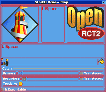 The containment relationship is: ``` UIWindow └ UITab (optional) └ UIStack (optional) └ UIWidget (UILabel, UIButton, ...) └ UIListView └ UIListViewColumn └ UIListViewItem ``` 🔎 Find UI You can usually control widgets through a proxy. However, you may want to use the UI without binding a proxy. --- After setting the name of the UI item directly, use the function below. 1. UIWindow - getUITab - getUIWidget 2. UITab - getUIWidget 🔃 Update UI In general, you can update the UI by modifying the properties within the updateUI block. ```tsx const proxy = UIWP.$(); //... proxy.onClick((w) => { w.updateUI(() => { w.isPressed(w.getIsPressed()); }); }); ``` --- It is possible to update the UI outside of the update block, but it is not recommended. It can cause unpredictable side effects. ```tsx const proxy = UIWP.$(); //... proxy.onClick((w) => { w.isPressed(w.getIsPressed()); w.updateUI(); }); ``` --- 💡 For windows and tabs, if some settings are changed, the window may reopen internally for the changes to take effect. This is independent of the life cycle. ♻️ UI Life Cycle 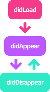 In StackUI, UI has a lifecycle and provides hooks according to its state. --- 1. didLoad - It is only called once when the UI is first loaded. 2. didAppear - Called whenever the UI appears on the screen. - For UITab, it is called when activated. - It has nothing to do with UIWidget.isVisible. 3. didDisappear - Called whenever the UI disappears on the screen. - For UITab, it is called when deactivated. - It has nothing to do with UIWidget.isVisible. 🖼️ Using Image Images are initialized with sprite numbers. (See the comments on `UIImageConstants` for related information.) --- UIImages can be divided into 3 types: 1. Sigle Image - You can use it anywhere you use the image. 2. Continuous Image - Available only on tabs and buttons. 3. Non-Continuous Image - A custom type, currently only available for buttons. --- Commonly used images are predefined and included in `UIImageConstants`. 💡 The amount of code included in the plugin can be burdensome, so please comment out unused images. 🥂 Styled Text TextBuilder allows you to create a styled string by combining TextNodes. There are 3 types of TextNode. 1. StringNode - A string node. - You can break the line with `\n`. 2. ImageNode - Inserts an image between string nodes. 3. NewlineNode - A newline node. - Display the next node starting from the next line. TextBuilder defines the font of the string, and TextNode defines the color and outline of the string. --- The following are the examples included in the demo. 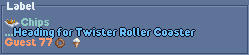 ```tsx const formatted = TB.$( TN.$( TN.$I(UIImageShopItemChips), TN.$( TN.$S("Chips\n..."), TN.$( TN.$S((1432).format(TextFormat.StringId, 53)) .color(TextColor.BabyBlue), TN.$NL() ).outline() ).color(TextColor.Celadon), TN.$S((767).format(TextFormat.StringId, 77)), TN.$I(UIImageShopItemDoughnut), TN.$I(UIImageShopItemIceCream) ).color(TextColor.Topaz) ).build(); ``` 📑 Learn more **Position and size of the UI** - The size of the window is automatically adjusted within the minimum and maximum sizes based on the size of the widget. - Widgets that are not sized are automatically scaled according to the size of the window. - Widgets that are not sized are placed at regular intervals in the stack. - Some widgets have a fixed height or width depending on their nature.🚀 Building
Now let's apply the plugin you developed.
(This description is based on TypeScript.)
First, install the dependent modules.
npm install
🏗️ Build
npm run build
Outputs file plugin.js to directory .../develop.
⚠ All StackUI-related code is included in the plugin you develop.
This is because the `openrct2.d.ts` file, which is the basis of StackUI,
is updated at short intervals, and compatibility issues may occur.
🔄 Auto Build
npm run watch
Whenever the plugin.js file is output by the npm run build command, it is copied to the plugin folder.
📀 Distribution
npm run build-product
Outputs the optimized plugin file, plugin.min.js, in the directory .../develop.
The default configuration is borrowed from plugin-devtools.
📜 License
This project is licensed under the MIT licence.